Introduction
Once a SuperSurv ensemble is trained, we must rigorously
prove that it outperforms the individual base learners. Because survival
data involves right-censoring, we cannot use standard classification
metrics like simple accuracy.
Instead, we evaluate the model across three critical dimensions: 1. Calibration: Does the predicted survival probability match the actual observed survival rate? 2. Discrimination (AUC & C-index): Can the model correctly rank which patient will survive longer? 3. Overall Accuracy (Brier Score): A combined measure of both calibration and discrimination.
This tutorial demonstrates how to extract these metrics and visualize
the benchmark comparisons using SuperSurv’s built-in
evaluation suite.
1. Data Preparation & The Extrapolation Rule
We begin by loading the metabric dataset and defining
our evaluation time grid (new.times).
Crucial Methodological Note: Your
new.times grid should never exceed the maximum
observed follow-up time in your training cohort. For example, if your
training data only spans 1 to 100 days, predicting survival at day 150
is extrapolation. Non-parametric models (like Survival Trees)
mathematically cannot extrapolate, and parametric models (like Weibulls)
will generate highly unreliable tail estimates. Always bind your
evaluation grid within the limits of your observed data!
library(SuperSurv)
library(survival)

data("metabric", package = "SuperSurv")
set.seed(123)
train_idx <- sample(1:nrow(metabric), 0.7 * nrow(metabric))
train <- metabric[train_idx, ]
test  <- metabric[-train_idx, ]

X_tr <- train[, grep("^x", names(metabric))]
X_te <- test[, grep("^x", names(metabric))]

# Our max follow-up is well beyond 200, so this grid is safe.
new.times <- seq(50, 200, by = 25)
2. Train the Benchmark Ensemble
We will fit an ensemble consisting of a Cox model, a Weibull model, and a Survival Tree using the default Least Squares meta-learner.
my_library <- c("surv.coxph", "surv.weibull", "surv.rpart")

fit_supersurv <- SuperSurv(
  time = train$duration,
  event = train$event,
  X = X_tr,
  newdata = X_te,
  new.times = new.times,
  event.library = my_library,
  cens.library = my_library,
  control = list(saveFitLibrary = TRUE),
  verbose = FALSE,
  nFolds = 3
)
3. Extracting Integrated Metrics
The eval_summary() function automatically generates
predictions on your test set and returns a clean, comparative table of
the integrated metrics across your entire time grid.
# Evaluate performance directly using the fitted model and test data
performance_results <- eval_summary(
  object = fit_supersurv,
  newdata = X_te,
  time = test$duration,
  event = test$event,
  eval_times = new.times
)
Note: Look for the model with the lowest IBS (Integrated Brier Score) and the highest iAUC/Uno’s C-index.
4. Visualizing Longitudinal Benchmarks
A single integrated number rarely tells the whole story. Different models excel at different follow-up periods (e.g., a Cox model might dominate short-term survival, while a Random Forest dominates long-term).
The plot_benchmark() function generates a stacked
dashboard to visualize this dynamic performance over time.
plot_benchmark(
  object = fit_supersurv,
  newdata = X_te,
  time = test$duration,
  event = test$event,
  eval_times = new.times
)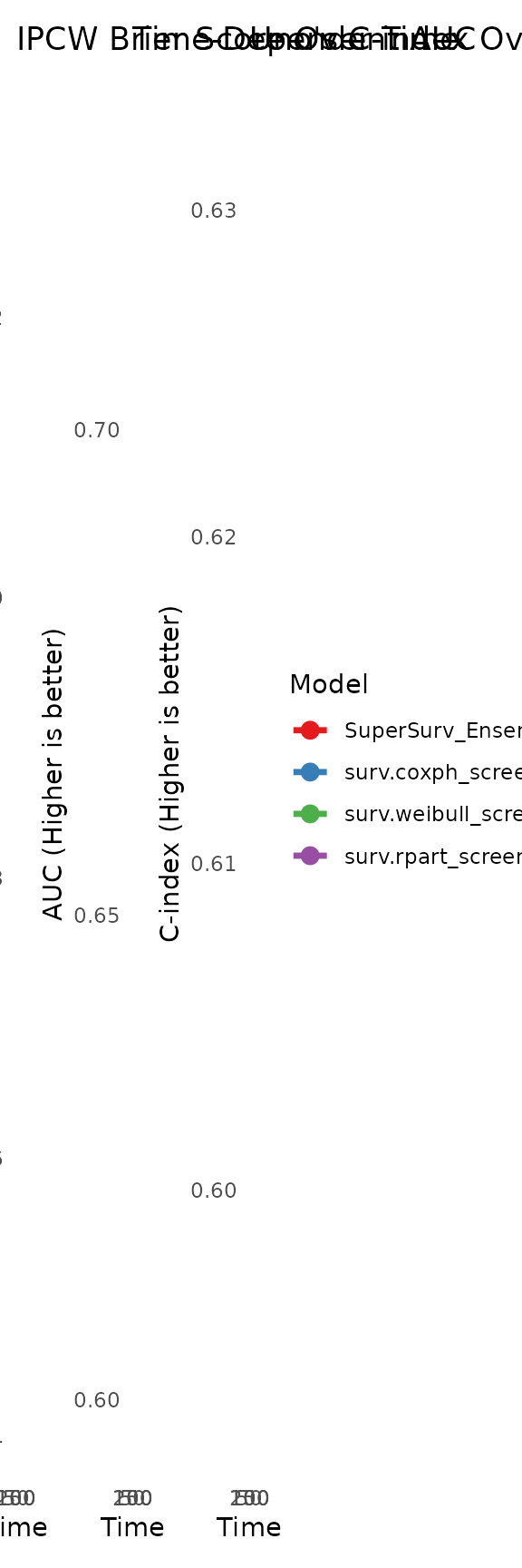
Interpreting the Curves:
-
IPCW Brier Score Plot: Look for the curve that
stays the lowest. The
SuperSurvensemble should ideally hug the bottom edge. - Time-Dependent AUC Plot: Look for the curve that stays the highest (closest to 1.0).
- Uno’s C-index Plot: Evaluates the global C-index using the specific predictions generated at each time point. Look for the curve that stays the highest.
5. Assessing Clinical Calibration
Before deploying a model to the clinic, doctors need to know if the probabilities are reliable. If the model predicts a patient has a 40% chance of surviving past Time = 100, do exactly 40% of similar patients actually survive?
We use plot_calibration() to evaluate this at a specific
clinical milestone. The function groups patients into risk quantiles and
plots their predicted probability against the actual observed
Kaplan-Meier survival rate.
# Assess calibration specifically at Time = 150
plot_calibration(
  object = fit_supersurv,
  newdata = X_te,
  time = test$duration,
  event = test$event,
  eval_time = 150,
  bins = 5 # Group patients into 5 risk quintiles
)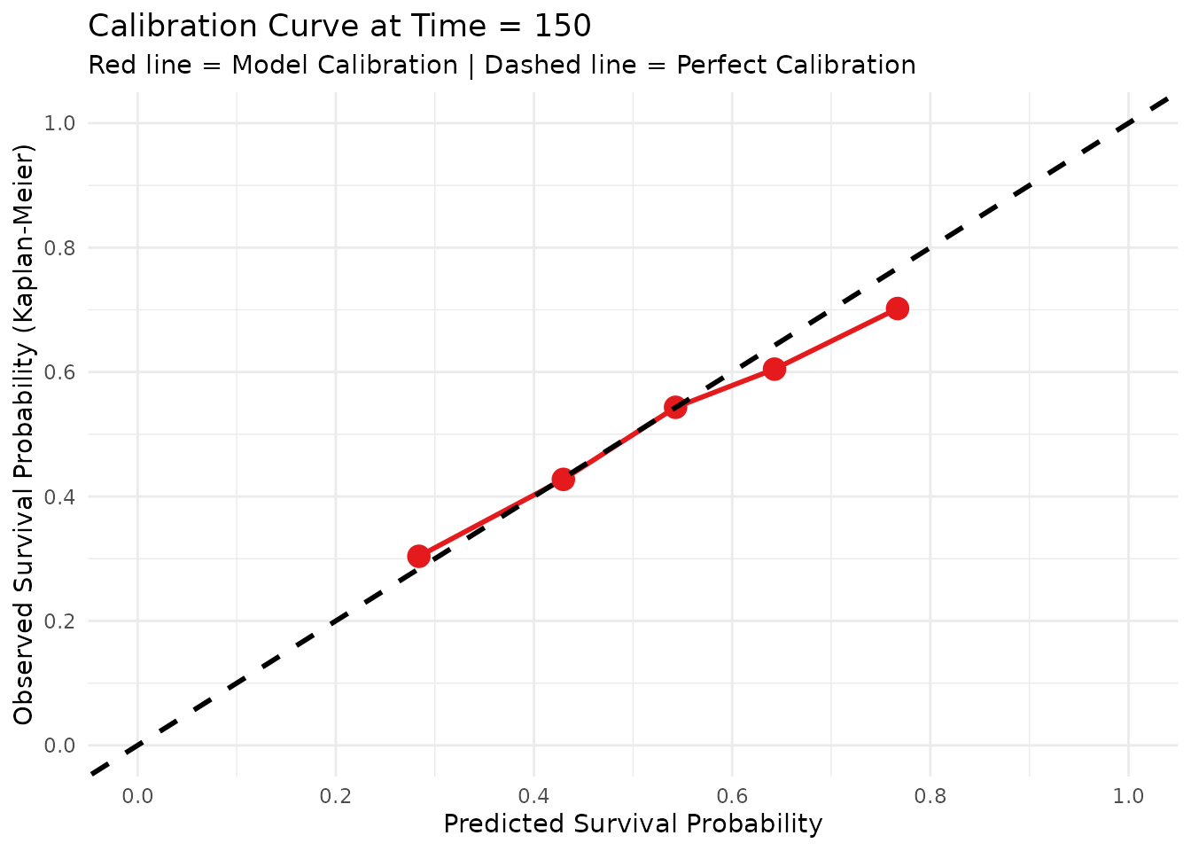
Interpretation: A perfectly calibrated model will follow the 45-degree dashed black line. Points above the line indicate the model is under-predicting survival (being too pessimistic), while points below the line indicate it is over-predicting survival (being too optimistic).